WYNKYN DE WORDE SOCIETY
First rays of a new rising sun
Named after the ‘Father of Fleet Street’, the Wynkyn de Worde Society was founded in 1957 to be ‘dedicated to excellence in all forms of printing’, with a membership covering a wide range of backgrounds from design and typography to production and publishing.
But as time and technology has moved on, the Wynkyn de Worde Society has always looked beyond the ever-changing techniques of the world of printing to the wider spheres of communication. Our challenge as honorary designers in 2023 was to update the identity to reflect this more contemporary and forward-looking vision.
Services
Bespoke logo
Editorial
Print design
—
Collaborators
Art direction—Alistair Hall, We Made This
Type—Jeremy Tankard
Paper—Fenner
Print—Typecast


At the sign of the sun
Wynkyn de Worde set up the first printing press on Fleet Street some time around 1500 in a former tavern – “at the sign of the sun”. And the society shares not only its name but also the traditional woodcut sign of the sun for their logo, which is occasionally updated and adapted by the honorary designers.
In 2023, it was our turn…


A new dawn
For a society with words and communication at its heart, and typography as the thread that binds it all together, the solution for the new identity was to embrace this fundamental truth: a symbol created from letters and a visual system that heroes typography and written language.
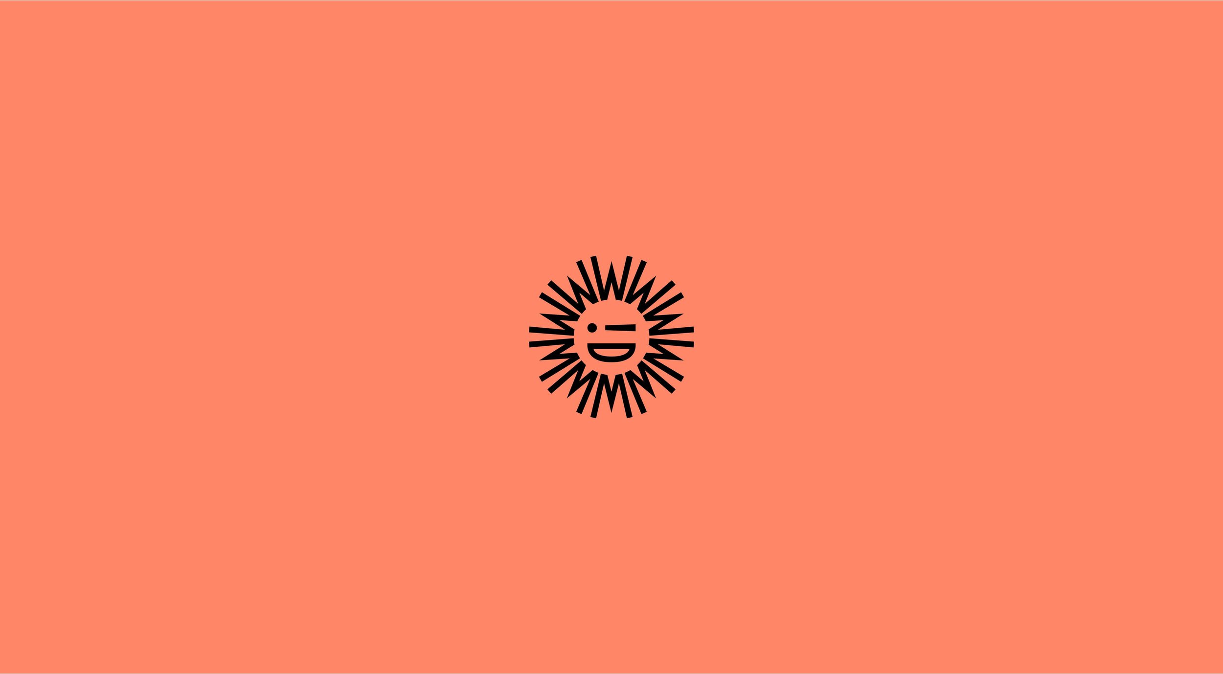
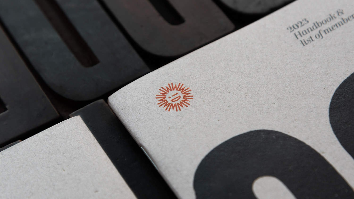
The new symbol takes the society’s initials, WDW, which have been carefully drawn to form an iconic smiling sun, with an exclamation mark adding a playful wink. Or should that be a wynk?

A contemporary take on tradition
As a society that loves print, printed pieces play a large role in the communications to members. So beyond a new symbol we introduced an identity system to be used across stationery, members’ handbook and invites. The new look balanced crisp, modern typography and a strong graphic structure with expressive letterpress printed type.
The result is a distinctive and cohesive identity system, with an expressive, playful and colourful flexibility, which can adapt to different situations and messages, while remaining true to itself and the underlying principles of print and publishing.
The wood type used throughout was curated from our collection and printed by hand in our workshop, and then digitised to create unique pieces of typography. There are also a handful of printers’ fists (or manicules) and arrows to add little flourishes, which feature in the Members’ handbook.


Every other month, a guest speaker is invited to talk to the society, and an invite is sent to members. The graphic structure within the identity allows for a fluid use of colour, graphics and illustration to make each invite appropriate for the event, topic and speaker.
For our tenure as honorary designers we had the pleasure of creating invites for political illustrator Chris Riddell, world-renowned book designers David Pearson, Jamie Keenan and Jon Gray, as well as the inspiring team behind the Birmingham Design Festival.


The symbol is simple and distinctive enough to have a subtle, playful tweak when the moment is right… For instance, the quiz night allowed for the ‘wink’ to be a little more quizzical ?


The Wynkyn de Worde Society is a relatively small organisation, with some 100 members and run by a small but dedicatedly passionate committee of 12 volunteers. With such a select and invested audience, it was essential that the identity simplified and unified the brand with clarity and focus, but also with joy and playfulness – it is, after all, primarily a social society.
If you’d like to join the ranks, or find out more, head over to the Wynkyn de Worde Society website.


More projects you might like
Bibendum
Relaunching an icon
FS Brabo
Fact meets fiction in an eloquent typeface launch
The British Hat Guild
An icon for an industry


