AWON GOLDING
A striking new identity.
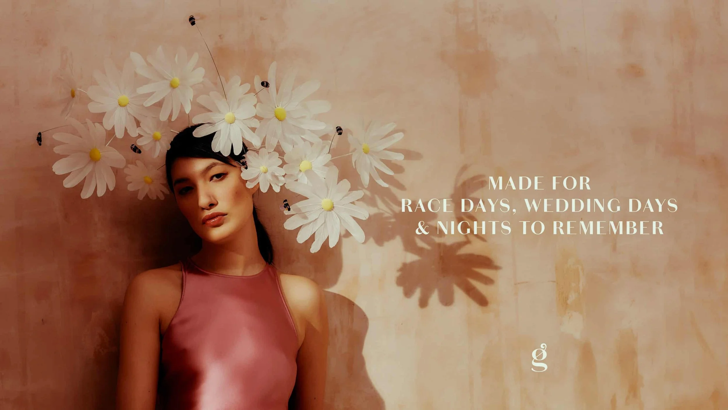
Made for Awon Golding.
Awon Golding is an award-winning London-based milliner renowned for her meticulously detailed, vibrant and playful hats and headpieces.
After setting up her eponymous label a decade ago, Awon’s creations have since graced the heads of global icons, royalty and pop-royalty alike, including Catherine, the Princess of Wales, Megan, the Duchess of Sussex, Daisy Lowe and Lady Gaga, as well as walking in Haute Couture shows in Paris. With such a prestigious audience, the brand identity needed a glow up to compliment the incredible hats.
Straddling the world of high fashion and high craft, Awon’s work is characterised by incredible attention to detail and refined craftsmanship balanced with a playful charm, wit and an undeniable joy. The new identity was built around this defining spirit.
Services
Brand identity
Bespoke logo
Tone of voice
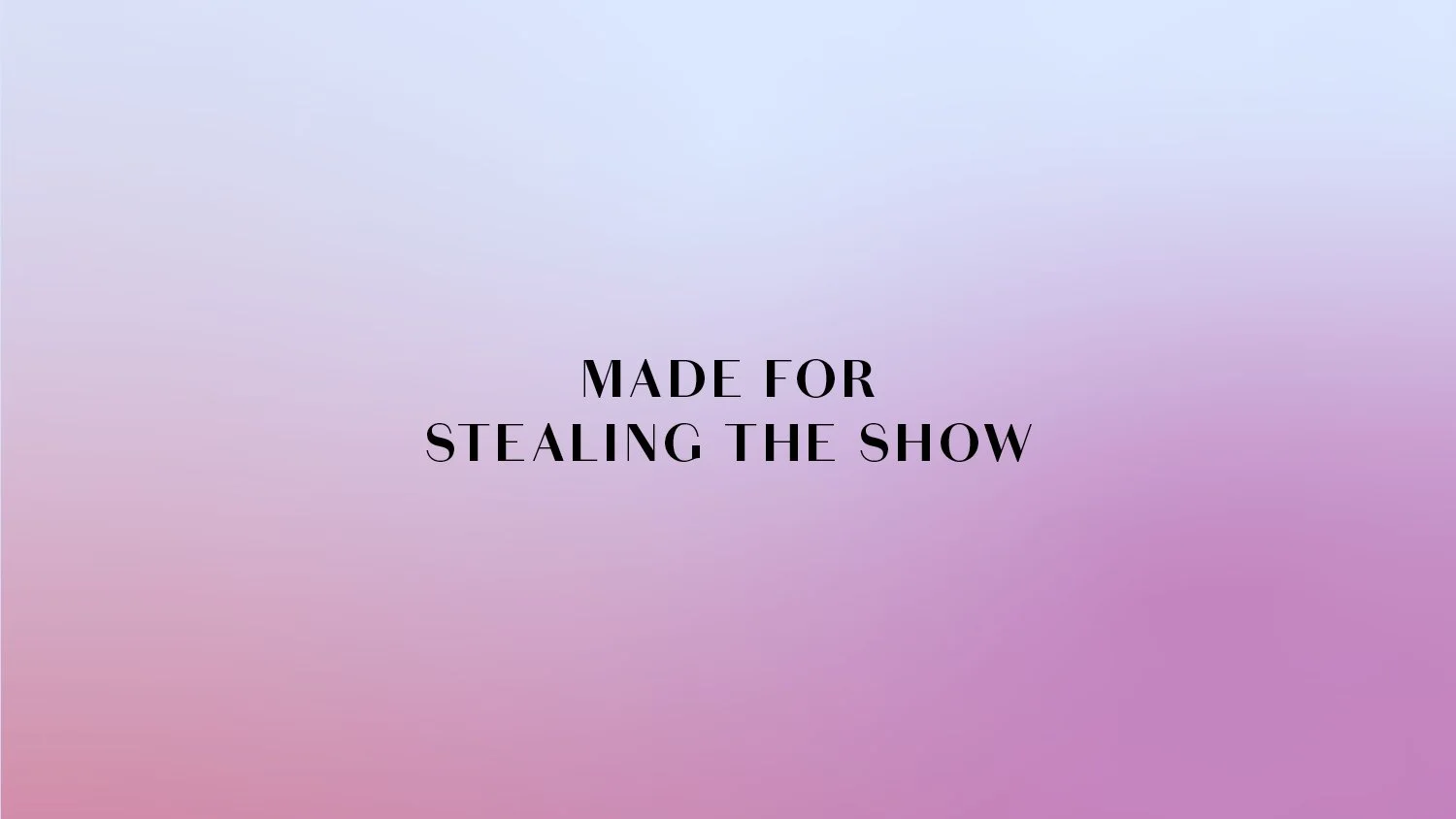
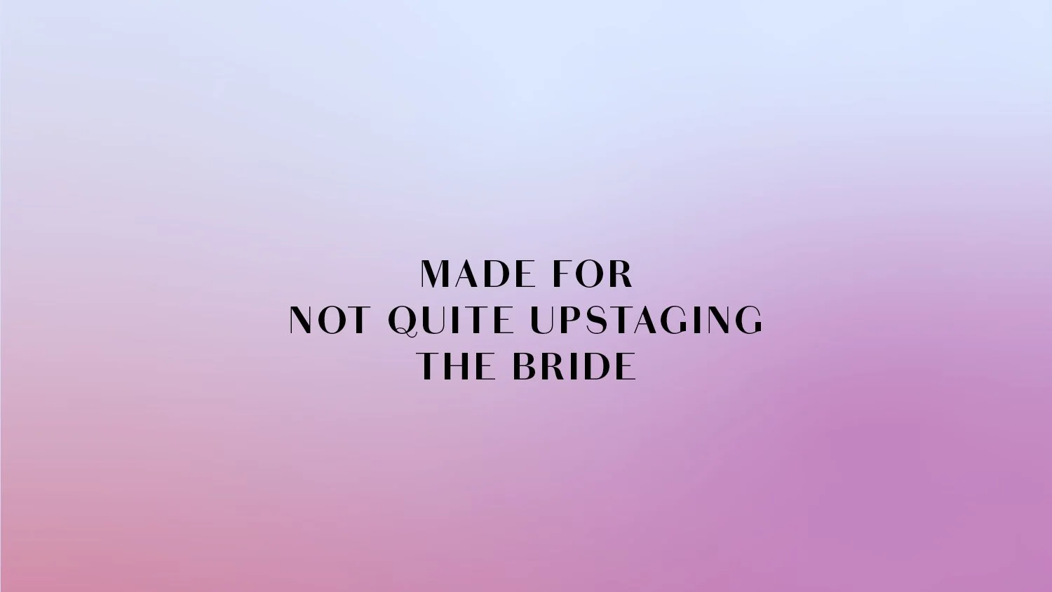
Made for not quite stealing the show
With the hats themselves the show-stoppers, the identity needed to be both strong enough and quiet enough to showcase these striking designs without either fighting for attention or getting lost in crowd – a tricky balance to achieve.
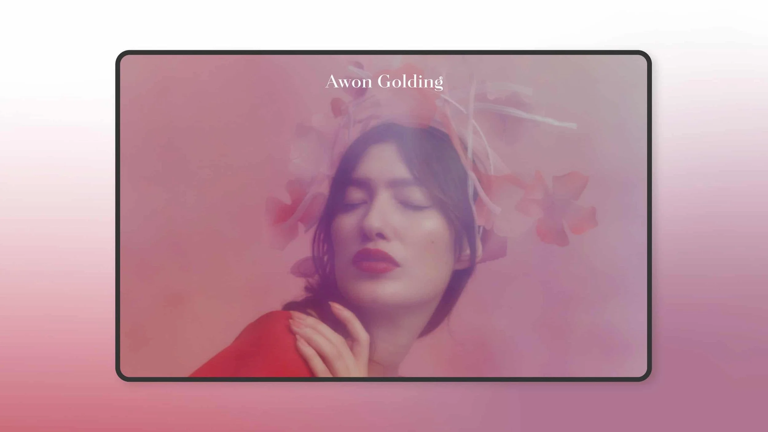
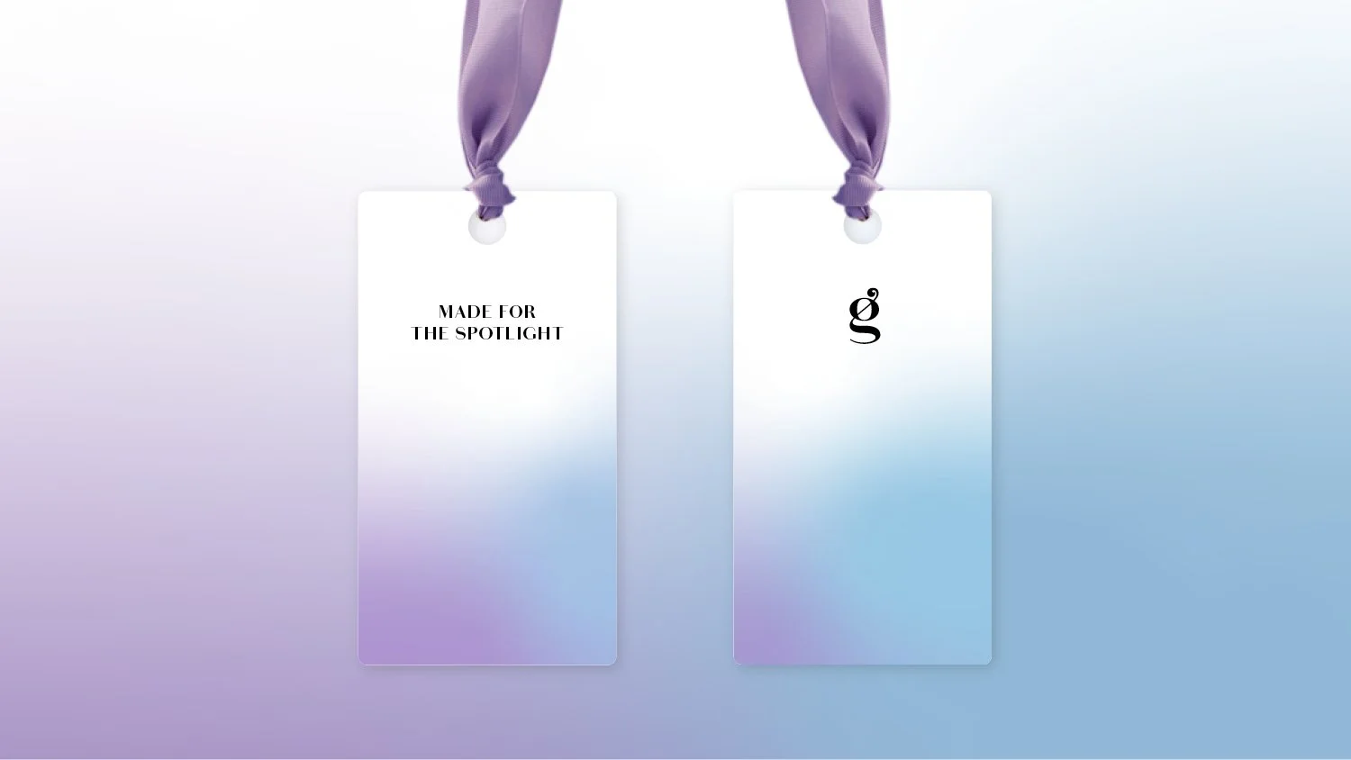
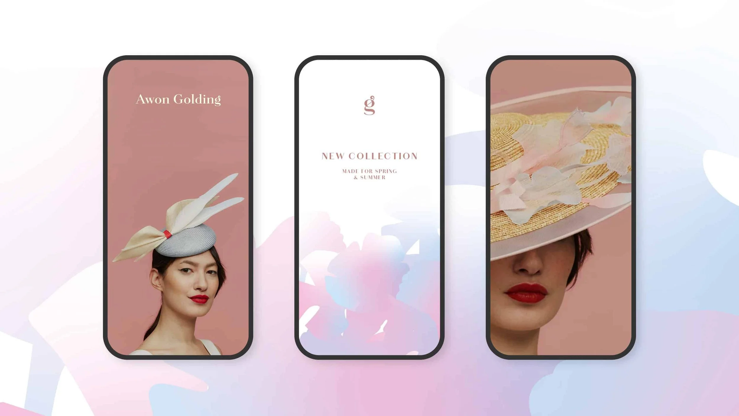
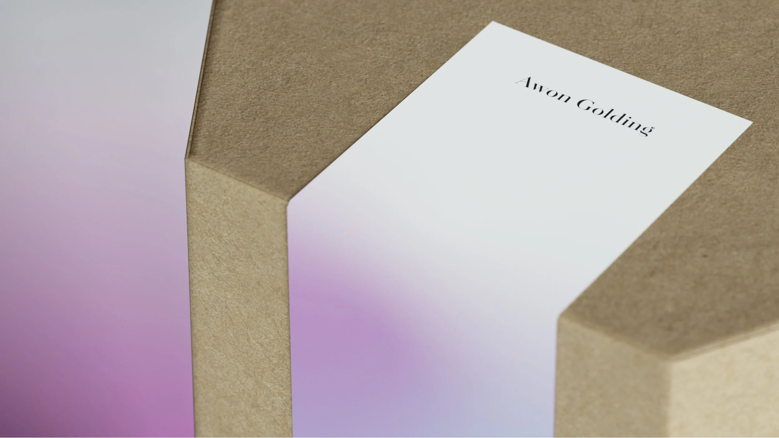
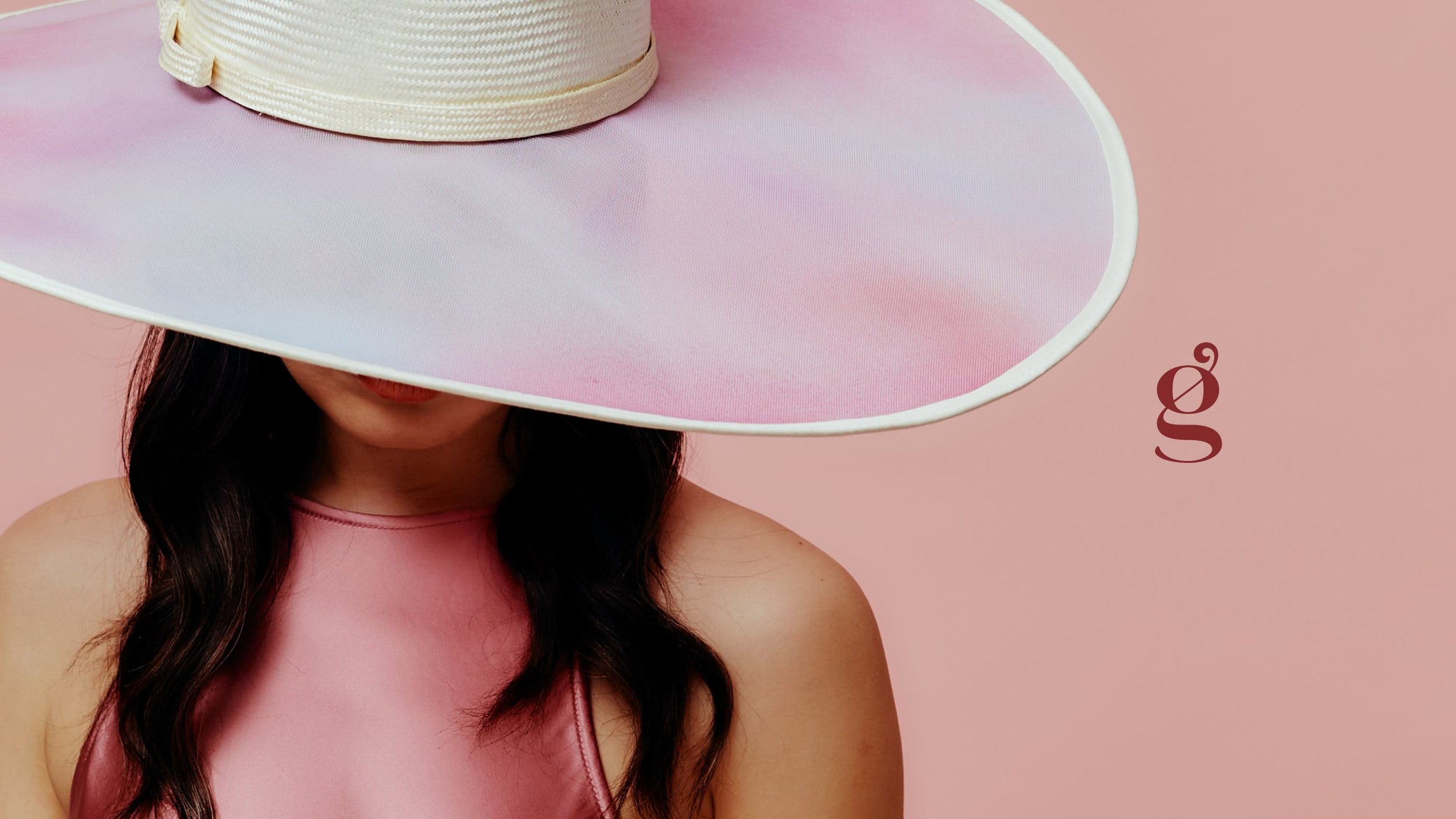
Drawing heavily from Awon’s use of colour, ombré and texture, the identity uses the same design language to create a seamless design system: colours, patterns and tones that compliment the hats, act as the perfect backdrop to the designs themselves. Instead of a rigid and fixed brand structure, as the seasons change so the identity shifts and evolves to mirror the ever-changing collections.
Made for moments of delight
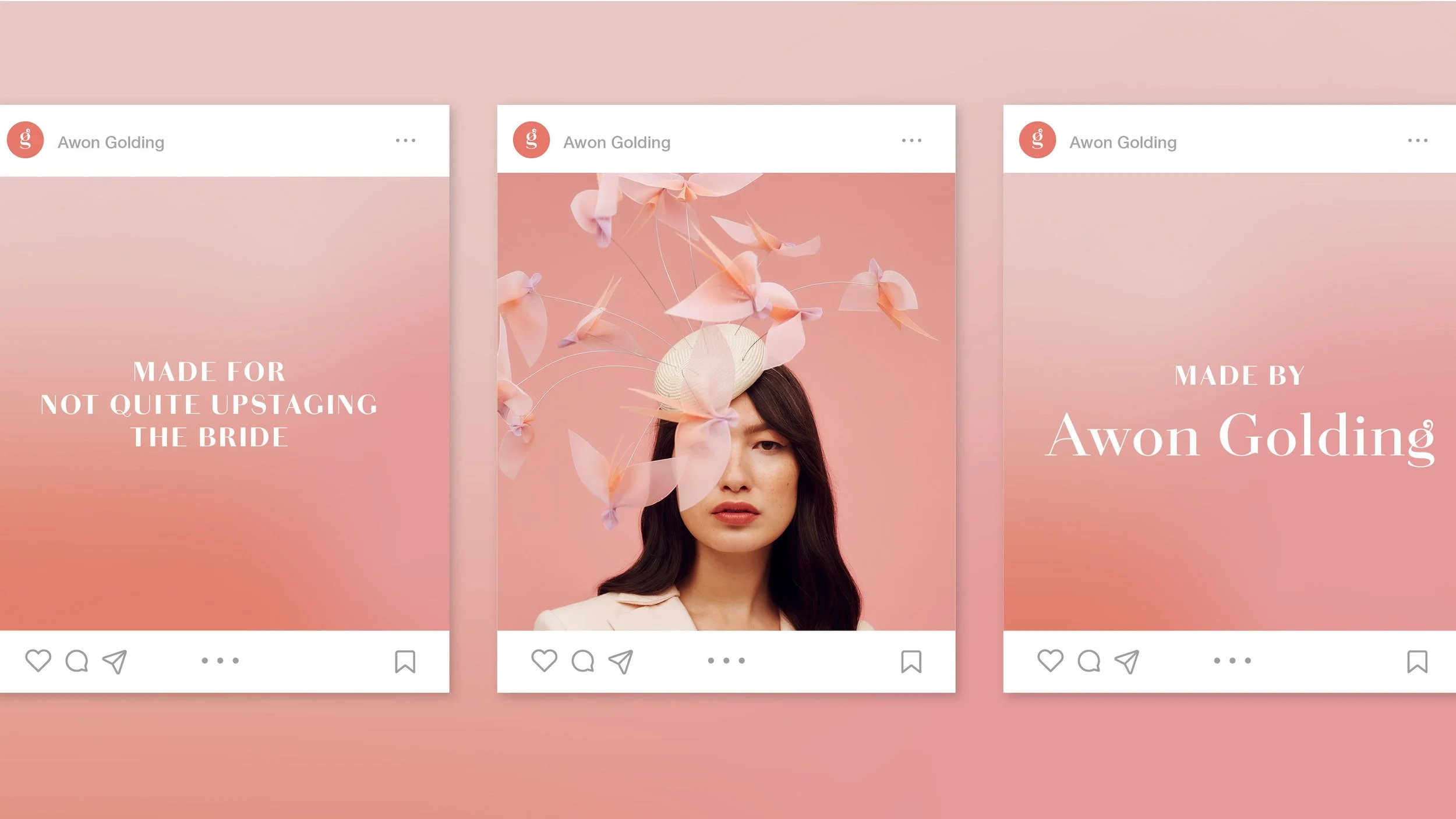
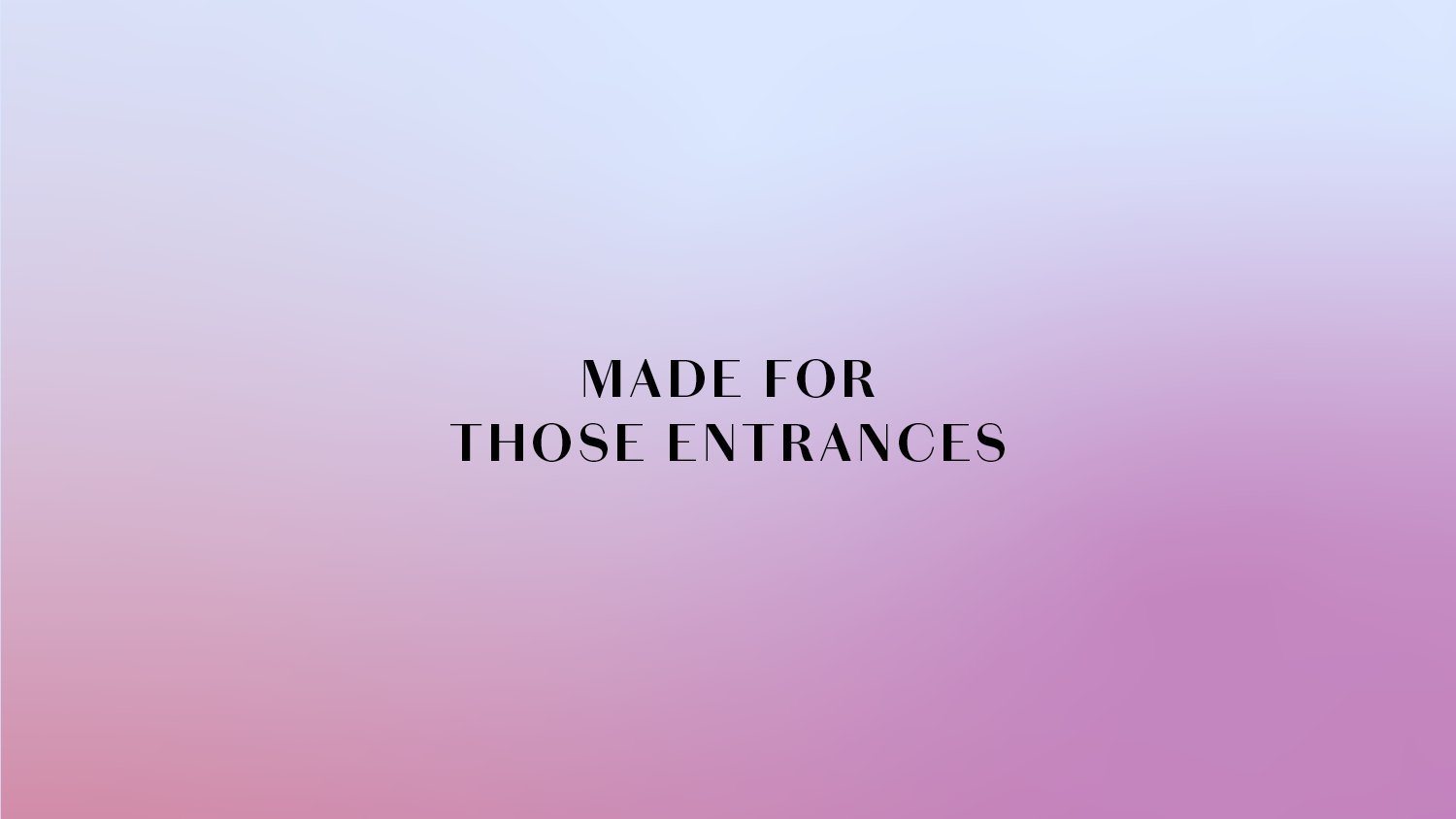
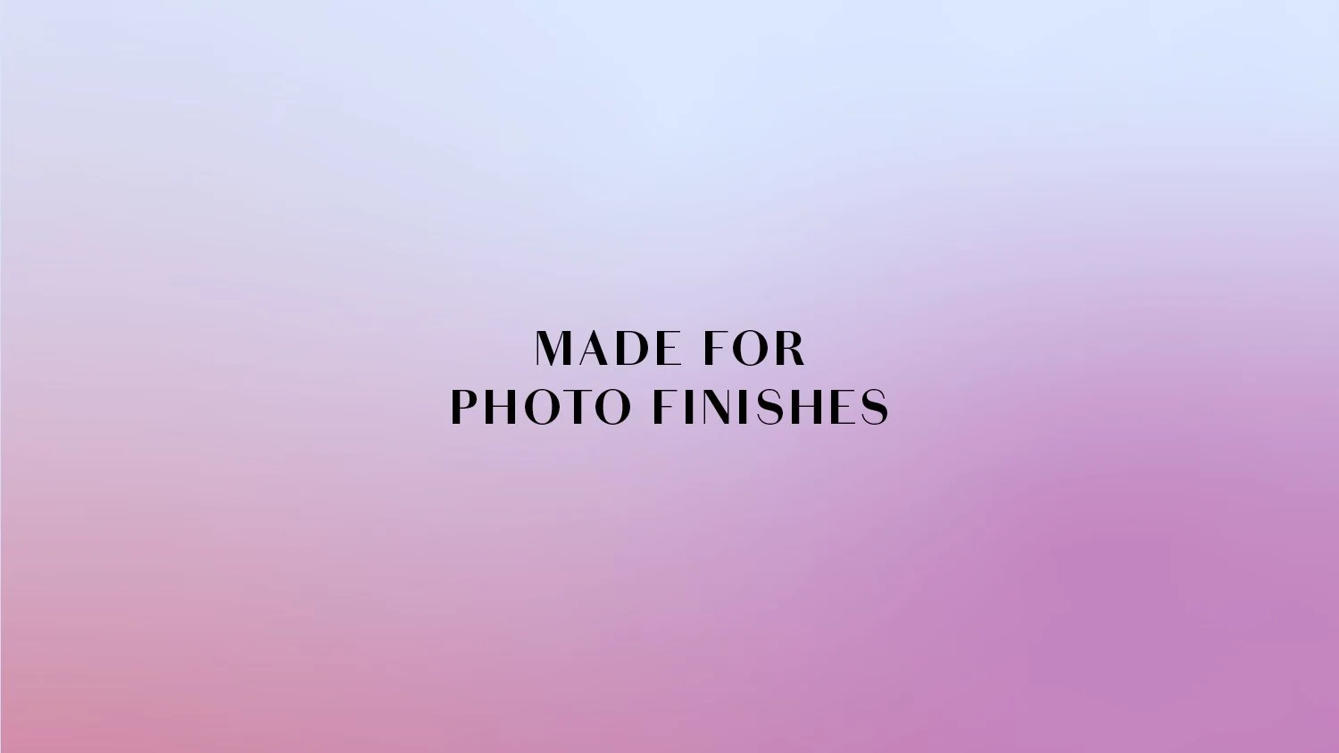
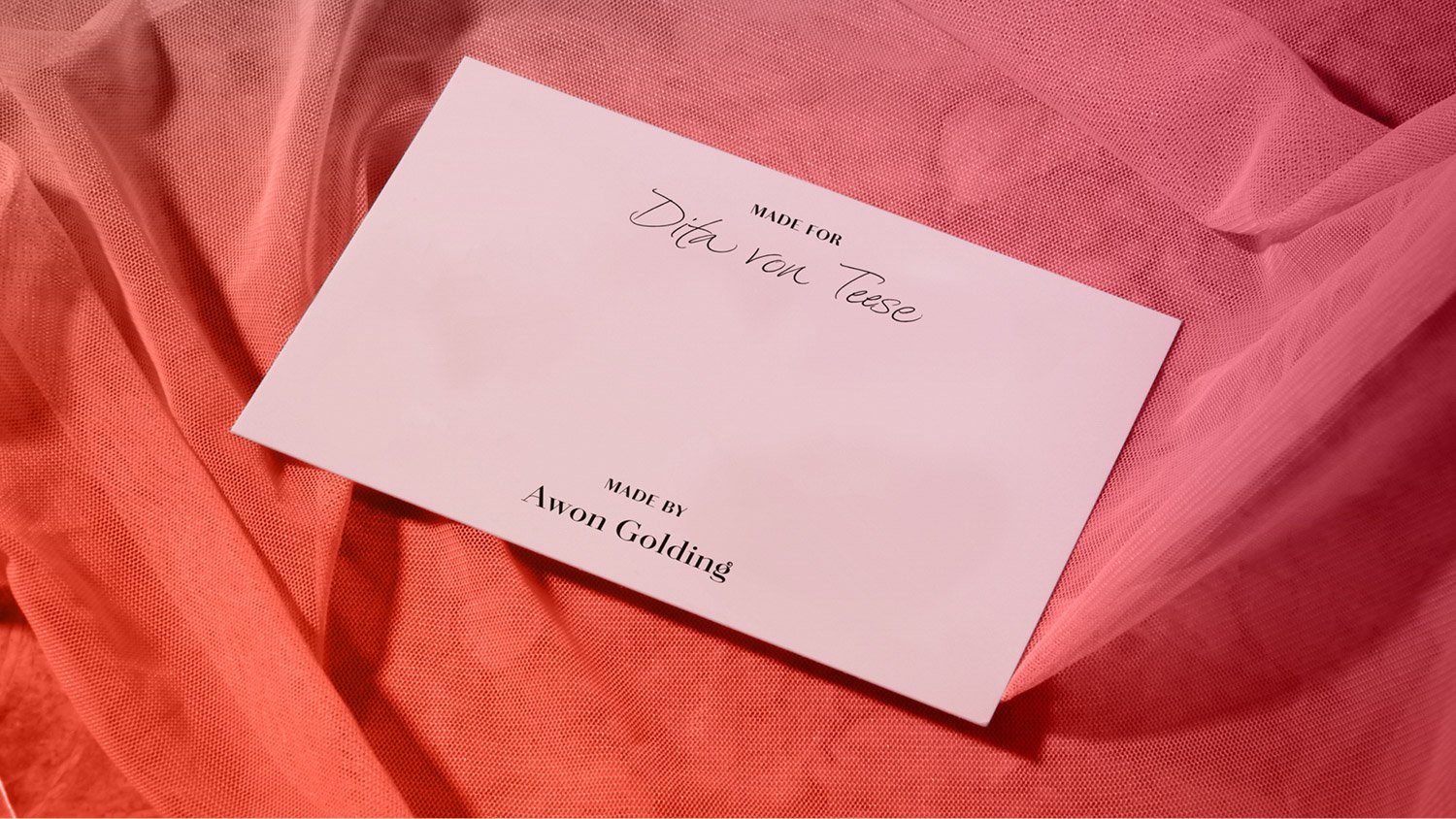
Awon’s hats are often playful, irreverent and joyous – they’re made to raise smile. The identity reflects this visual charm in the verbal language, which happily plays around what the hats were made for, from ‘stealing the show’ to ‘not quite upstaging the bride’… It’s a serious brand that doesn’t take itself too seriously.
Made for elegance
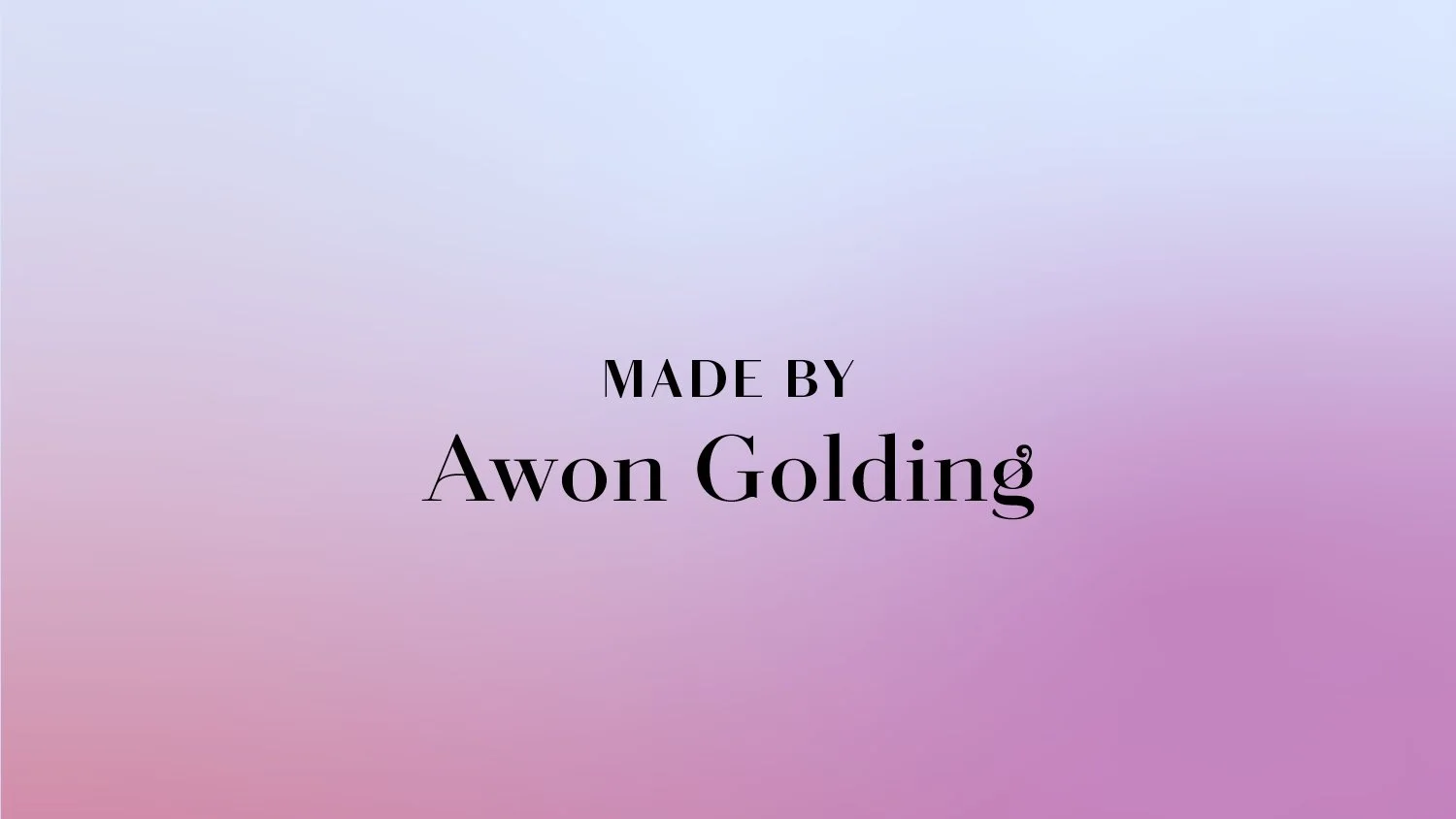
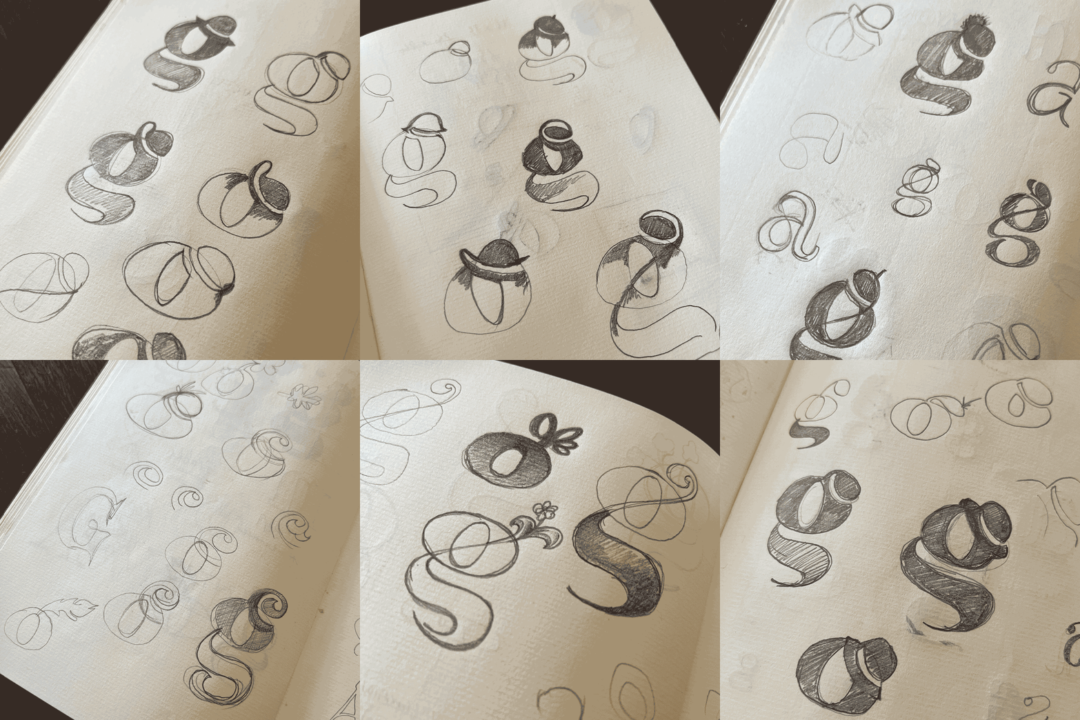
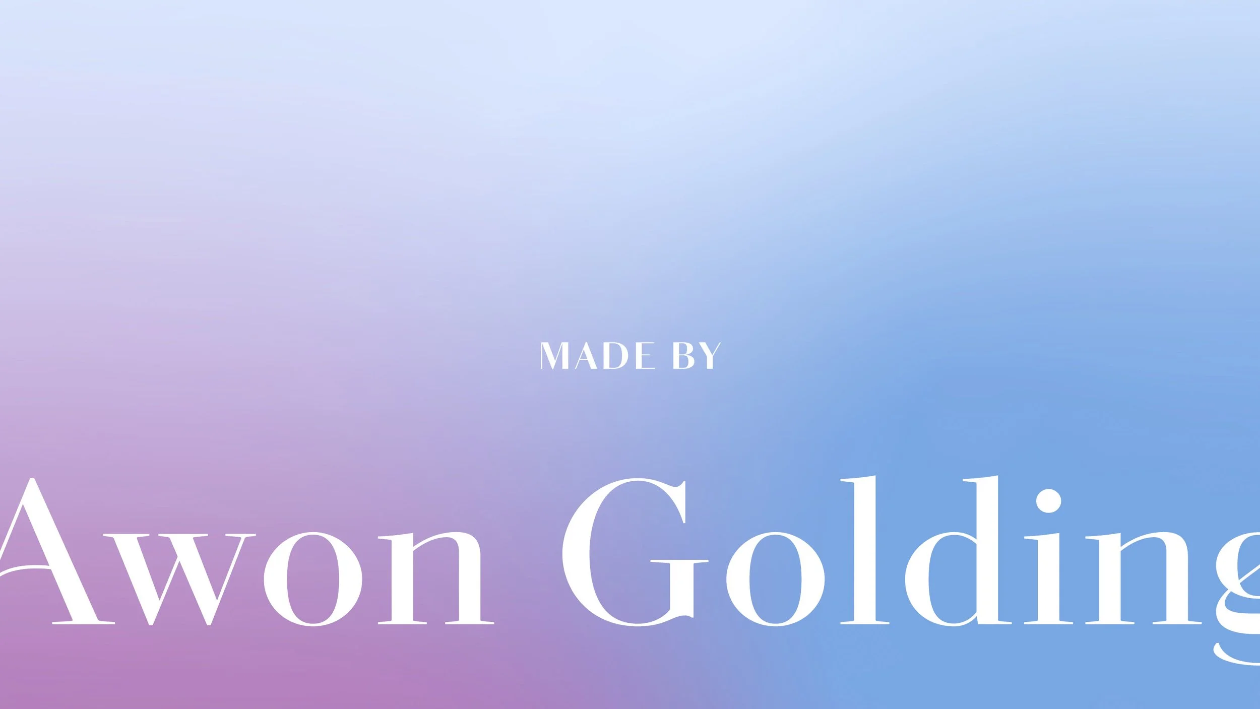
The identity is topped by the logotype – a bespoke contemporary take on the classic Didones so firmly associated with high fashion. The letters were drawn with elegant high-contrast between the thicks and thins, while the less formal details add some fluidity and character. The lowercase g at the end of the logotype, with its swirling ear to loop flourish – reminiscent of a tilted fascinator and ribbon – can be used on its own as a symbol: a simple shorthand for the brand.
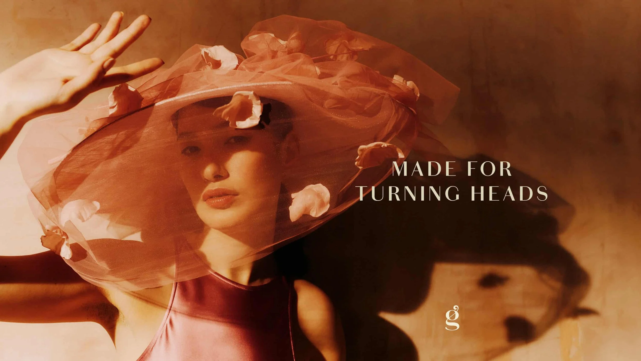
Made for turning heads
As Awon Golding continues to adorn Ascot, steal shows, and be celebrated by celebrities, the new identity will follow, subtly shifting as the seasons change while remaining the consistent and clear core of the brand.
—
See the hats at awongolding.com
Hat photography courtesy of Awon Golding
Typeface is Chiswick Sans from Commercial Type

More projects you might like
We Are
A brand for the world’s first family history social network and publishing platform
Wynkyn de Worde Society
First rays of a new rising sun
The British Hat Guild
An icon for an industry


