FONTSMITH: STORYTELLING SERIFS
A bold launch campaign to inspire publishers
Boutique type foundry Fontsmith are well known for creating brilliant personality driven typefaces, but their library had always been a little light on serifs.
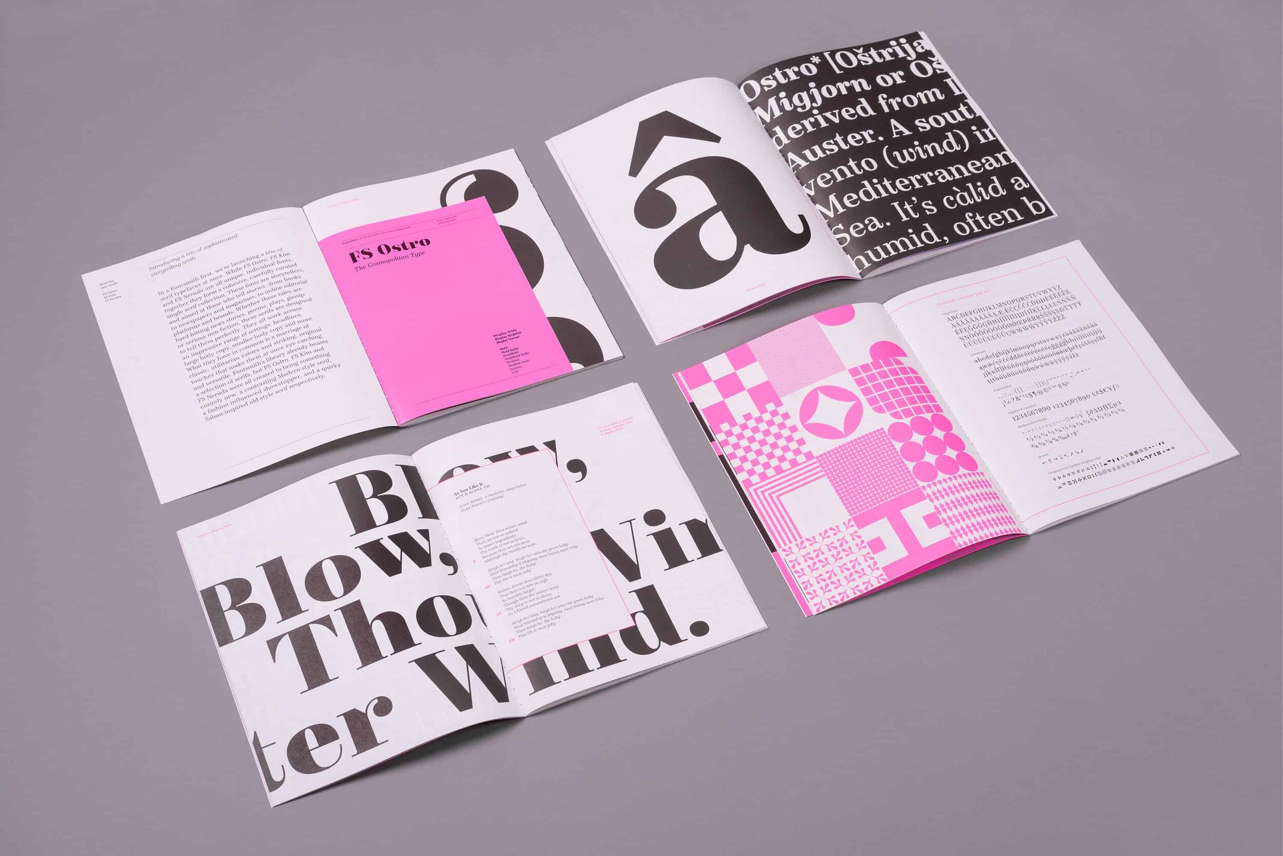
So having developed not one, not two, but three beautiful new serif typefaces, they wanted to create a splash and launch all three over a month-long marketing campaign across digital and social channels, culminating in the release of a limited edition printed specimen.
Services
Campaign design
Printed collateral
Social media content
Online content
—
Collaborators
Copywriting—Emily Gosling
—
D&AD Award: Typography

A trio of storytelling serifs
Our first task was finding a unifying idea to bring the trio of very different type families together. Although each typeface has its own distinct personality, the one thing they have in common is that they are all perfect for storytelling, editorial and publishing uses.
This idea sat at the heart of the design, focusing on those who tell stories from books to newspapers and magazines, online editorial platforms to brands. Words and stories are their currency, so reflecting these worlds allowed us to stretch the design and content from the serious to the irreverent in order to demonstrate the breadth and range these three new faces could cover.

Facts and fiction
This flexible approach meant that the design could take inspiration from the areas that each of the typefaces were influenced by and could be used for…
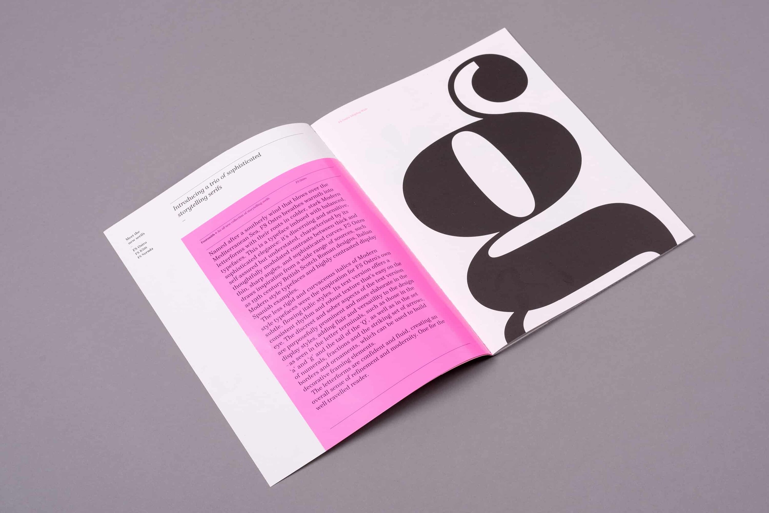
FS Ostro, the cosmopolitan, Modern-style typeface expressed itself through facts and fiction, plays and poetry.
FS Kim, the striking showstopper, came to life through all things fashion.
FS Neruda the smart, inquisitive type with its roots in newspapers, showcased tongue-in-cheek headlines alongside playful asides.
A month-long launch
Over three weeks, each font family had its own launch online across social media, email campaigns and the Fontsmith website.
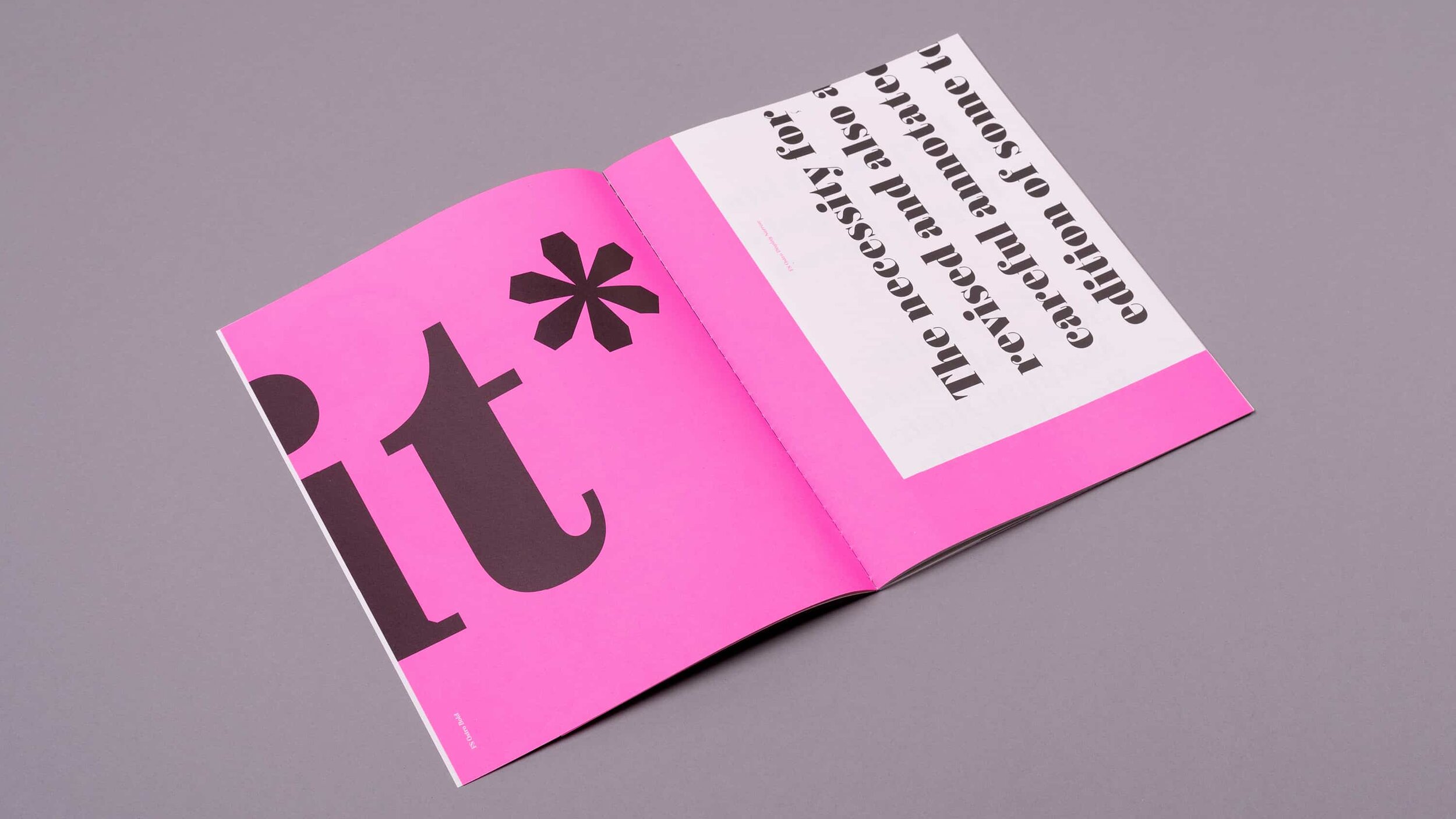
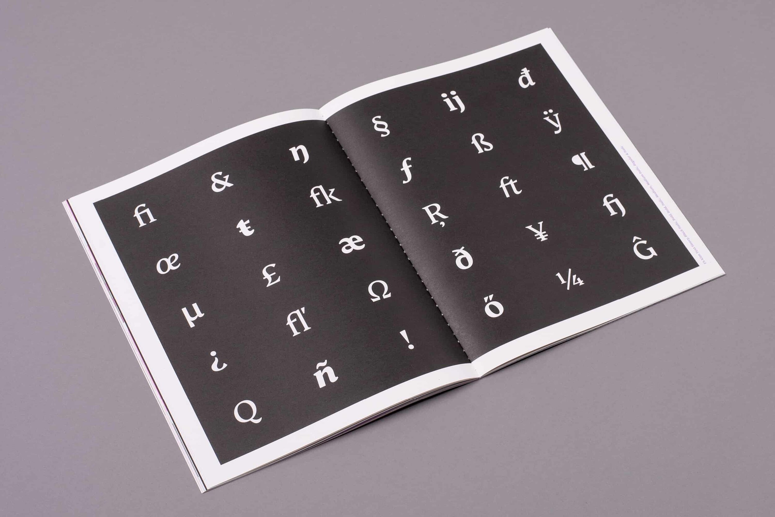
At the end of the launch, the printed specimen that combined all three typefaces was released in an impactful, but cost-effective, newspaper-style supplement. The format allowed the trio of typefaces to feel unified, but allowed each of them to have their own individual chapter. The result is a beautifully curated collection of typography.


“With over 50 styles between the three families there was a lot to show. We wanted a beautiful print piece that really focused on the design of the fonts, showing details large and highlighting the individuality of each typeface—which is exactly what we got from Counter Studio.”
Jason Smith, Founder, Fontsmith


In the news
The vibrant specimen—printed in three punchy fluorescent inks with a two-colour stitched binding—was a great success, catching the eyes of designers’ around the world, being featured across the design press, and was even awarded a Wood Pencil at the prestigious D&AD awards.

More projects you might like
Octopus Publishing: Endeavour
The new face of non-fiction
The British Hat Guild
An icon for an industry
FS Brabo
Fact meets fiction in an eloquent typeface launch


